(7) Converting Google Community Mobility Reports into HyperCube Format
The Last Article showed that COVID-19 related data disclosed by Johns Hopkins University can be converted to the HyperCube format to allow Pivot analysis with freely interchangeable vertical and horizontal axes.
However, the real benefit of HyperCube is in the integration and analysis of multiple datasets of different origins. In this article, we are going to convert data other than the Johns Hopkins University in to the HyperCube format and analyze both in parallel.
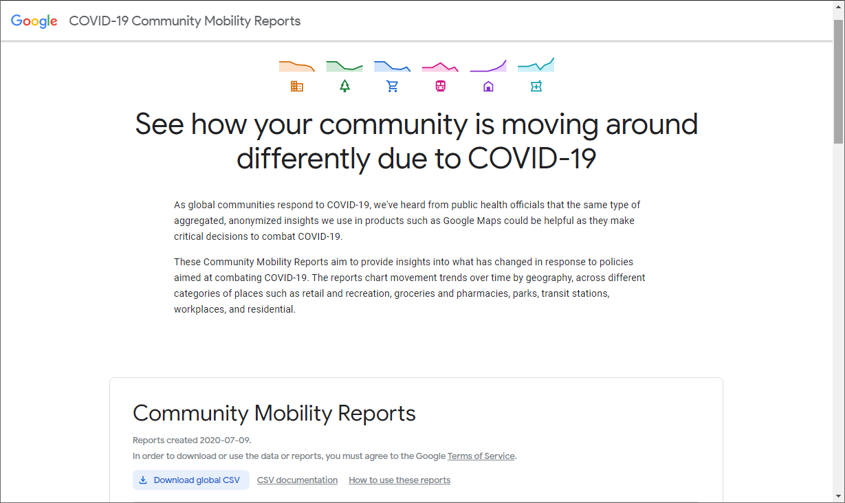
The Google Community Mobility Report
Google Community Mobility Report is data on the "rate of human mobility" compared to pre-Corona. Simply put, it's an indicator of "how many people are out/moving today".
- If the number is large, it would mean that a large number of people are out and moving around
- However, the figures themselves are not simply the number of visitors or the length of stay, but rather the median change based on "the median of five weeks from January 3 to February 6, 2020, before the COVID-19 epidemic began".
- The reference value is set for each day of the week and the percentage change from the reference value of the day is reported daily.
- The report covers 131 countries, is reported by region (in Japan, by prefecture).
- Reported by the following categories
- Retail & recreation
- Grocery & pharmacy
- Parks
- Transit stations
- Workplaces
- Residential
For example, lets say there is a daily reporting of information in the following level "On Friday, July 24, Osaka in Japan saw a percentage decrease in movements to workplaces compared to the median day of the week for the 5-week period of Jan. 3 to Feb. 6.
In response to COVID-19, measures such as "keeping a social distance" in Europe and the United States have been taken in Japan to "avoid the Three Cs: Closed-spaces, Crowded-places, and Close-contact-settings". These measures include encouraging people to work from home, requiring people to refrain from leaving the home, and in some countries, placing people on home-stay orders.
Google's Community Mobility Report will help see the extent to which these measures are reducing the movement of people and the results, such as the reductions of COVID-19 infections and deaths as a result of reduced migration.
Verify and convert the actual data to HyperCube format
The data in the Google Community Mobility Report is also disclosed in a CSV file, which is updated daily. The actual data in that CSV file is in the following format
These column names and column meanings are as follows
| No |
Column name |
column meaning |
| 1 |
country_region_code |
country/region code |
| 2 |
country_region |
country/region |
| 3 |
sub_region_1 |
sub-region 1 |
| 4 |
sub_region_2 |
sub-region 2 |
| 5 |
iso_3166_2_code |
ISO3133-2 code |
| 6 |
census_fips_code |
Federal Information Processing Standards (FIPS) |
| 7 |
date |
date |
| 8 |
retail_and_recreation_percent_change_from_baseline |
rate of change in human mobility |
| 9 |
grocery_and_pharmacy_percent_change_from_baseline |
rate of change in human mobility (grocery and drug stores) |
| 10 |
parks_percent_change_from_baseline |
rate of change in human mobility (parks) |
| 11 |
transit_stations_percent_change_from_baseline |
人rate of change in human mobility (transit_stations) |
| 12 |
workplaces_percent_change_from_baseline |
rate of change in human mobility (workplace) |
| 13 |
residential_percent_change_from_baseline |
rate of change in human mobility (residential) |
This is then imported into the database and converted to HyperCube, just like the Johns Hopkins University data.
The concepts are Numbers 10-13; the dimensions can be "country/region", "sub-region" and "date
Cross analysis with data from Johns Hopkins University
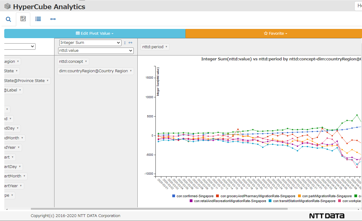
Once the data is in HyperCube format, the data can be used on the same level of analyzing as any other datasets, transcending the difference in origin between "Johns Hopkins University" and "Google Community Mobility".
The figure below shows a line graph of Singapore comparing the data on "the number of infected people originating from Johns Hopkins University" and "the change in the number of people moving from Google Community Mobility".
Summary: HyperCube transcends differences in data sets
In this article, we followed up on the COVID datasets from both the data from Google Community Mobility and the Johns Hopkins University and using the two to perform a comparative analysis. As you can see, the strength of the HyperCube data model is that it makes it easier to compare data of different origins.
The next article will perform a flexible correlation analysis by aggregating the various attributes of each country in one place in a NoSQL database.