(8) Combining diverse data for Scatterplot analysis
The previous article explained the combination of two datasets; "Google Community Mobility Report" with the COVID-19 related data disclosed by Johns Hopkins University. Creating HyperCube, and allowing for a cross-mixed pivot analysis of the two data.
The first article introduced two "finished concepts" in this series, the first of which, "Analysis of the data in chronological order," was explained in the previous articles. This article will elaborate on the second concept, "2-axis scatterplot".
Finding parameters correlated with infection and death
Despite the fact that countries around the world now have roughly similar countermeasures for COVID-19, the number of infections and deaths from one country to another varies widely, and the reasons for this are not clear.
- Smokers seem to be more susceptible to severe infections
- Having an underlying disease such as diabetes seems to be more prone to severe illness.
- In countries where the habit of washing hands is ingrained, it may be less likely to spread.
- Countries where BCG vaccination is mandatory have a lower rate of infection.
Various theories have been cited through the media as above (some from credible sources, and others just being a theory)
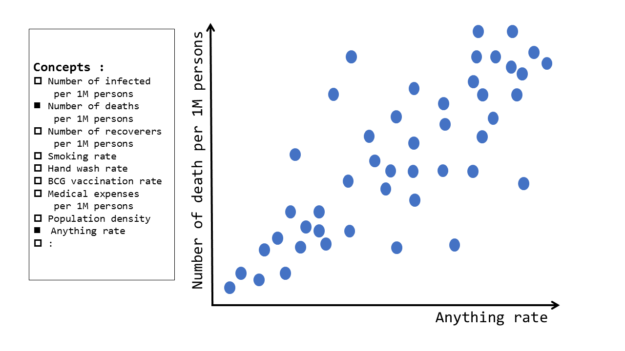
And the use case for evaluating the correlations is to select any two axes(in this case the theories mentioned above) conform the relations of the data in form of a scatterplot.
Data form by "Country"
Previously, HyperCube enabled multi-axis extraction and analysis by creating JSON files in the unit by "Country x Region x Date x Key Elements". The concept of "date" was especially important when following up on the changing number of infected people.
This analysis would be more of a macro trend, theory analysis of the idea "number of infected people might increase if more people smoked", rather than a daily information of "today's smoking rate" or "tomorrow's smoking rate". For this example, we are going to abandon the concept of "date" and create the following "country" data.
Collecting source data
COVID-19 Related
For information on COVID-19, we will use the data disclosed by Johns Hopkins University, as before, to obtain the number of people infected, seriously injured, killed, and recovered by country. The data are updated and disclosed daily, but this time we will get data from any point in time.
Demographics
The purpose of collecting total population data by country is to make it easier to compare large and small countries by assessing them at a "rate" of "number of infected people per million". In this case, we used data from the World Bank.
Median age
Testing the hypothesis that older people are more likely to be severely ill, we will be using a set of median age data by country from Kaggle.
Smoking Rates
Testing the hypothesis that smokers are more likely to become seriously ill, we will use the data World Population Review, a data from the World Health Organization (WHO).
Obesity Rates
Testing the hypothesis how obesity effect the infected, we will use the data World Population Review also a data from the World Health Organization (WHO).
Integrating Data
The source data is often published in CSV, but no matter the format, it will be imported into the database. A schema-less NoSQL DB makes it easy because the user does not have to CREATE TABLE every time.
We will merge each dataset by "country" as described above. For example, in the case of Thailand, it will be a JSON file like the followingwa
Depending on the source data, the information for some countries may not exist, but, we will use the data that are available.
Visualize the result
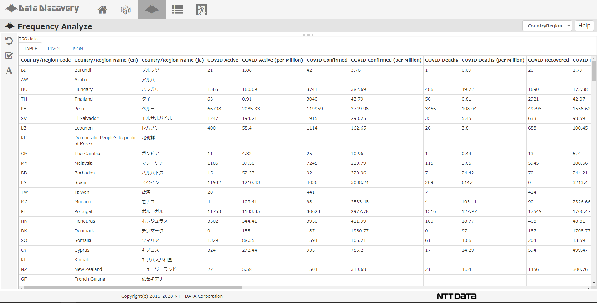
Let's take a look at the results in the NTT Data solution DataDiscovery's; Frequency Analyze screen.
If you look at the "Table" tab, you can see 256 countries/regions are lined up vertically and the various attribute values we have captured so far are lined up next to each other.
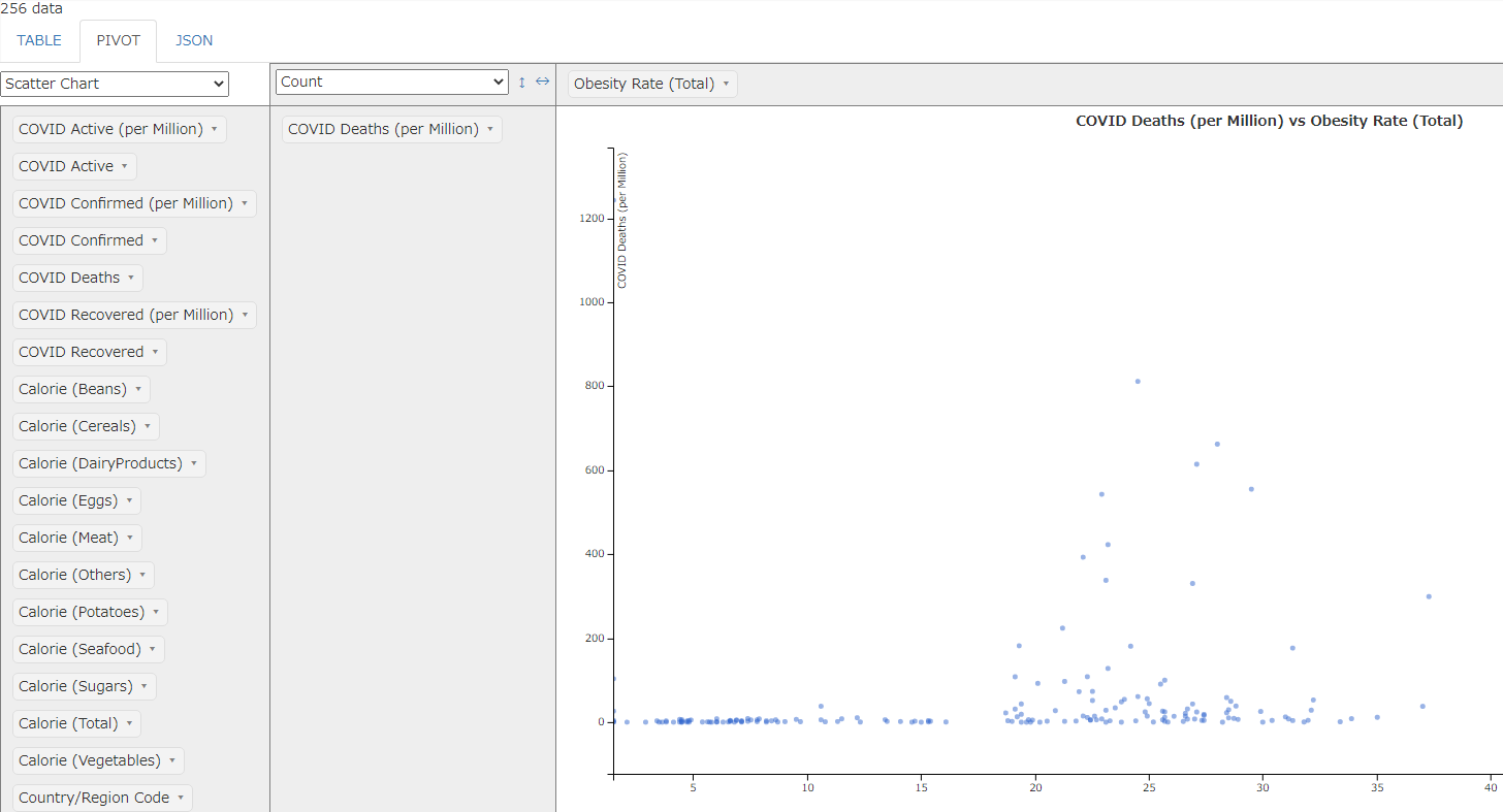
Press the "Pivot" tab and set "Deaths per Million" on the vertical axis and "Obesity Rate" on the horizontal axis to draw a scatterplot. Each blue dot in the scatterplot represents a country. (There doesn't seem to be much correlation between the two.)
Series Summary: Quick Analysis using NoSQL
Once again, we have collected data from various origins and integrated it in a NoSQL database for analysis.
What we wanted you to feel throughout this series is the "ease of use" of a NoSQL database, and the little effort it takes to add tables and columns compared to relational databases. The Articles might be written as if we planned out the data collecting process, but in reality, we are adding data as we go and working flexibly within our team discussing which data set we want to import next.
On the other hand, even though it is schema-less, we need to consider the data model to unify our datasets, and the code system needs to be consistent. The longer you leave things scattered and unorganized, the harder it becomes when time comes analyzing them.
However, it is not necessary to apply a "perfected standard" from the beginning; the strength of the NoSQL database is that we can adopt an "organize as-needed" approach.